Reading the Numbers
The numerical data in your CER report is built around a simple 1–5 rating scale. Understanding what the mean score represents, how to read the frequency breakdown alongside it, and how individual items roll up into the Ten Principles framework will allow you to draw meaningful insights from your results.
The Rating Scale
The CER uses a frequency-based rating scale. Students are asked to indicate how often they observed or experienced a particular teaching practice or behaviour during the course. All items use the same five-point scale:

A higher score indicates that students experienced a teaching practice or behaviour more consistently throughout the course. All questions also include a Not Applicable (0) option. Students who select this are excluded from all calculations for that item, ensuring the mean only reflects the experiences of students for whom the question was relevant.
Frequently Asked Questions
What is the difference between the Learning Experience and Course Design sections?
These two sections of the report illuminate different dimensions of your course:
- Learning Experience reflects your teaching practice — how clearly you communicated expectations, how available and responsive you were outside of class, how effectively you used technology, and how well your teaching supported student understanding and engagement.
- Course Design reflects the structure and architecture of the course itself — the syllabus, learning materials, the alignment between content, assessments and learning outcomes, grading criteria, and the overall workload.
Some items, such as workload, appear in both sections because they affect both the teaching experience and the course structure. Comparing related items across both sections can help you identify precisely where an issue originates and what kind of response is required.
What is the Mean Score and how do I interpret it?
The mean is the average rating for a given question. It is calculated by summing all valid responses and dividing by the number of students who answered. The closer the mean is to 5, the more positively students rated that aspect of their experience.
As a general guide for interpreting mean scores:
Note: These thresholds are intended as practical guidelines, not rigid cut-offs. Context always matters. A score of 3.5 on workload in a postgraduate course where students are balancing full-time professional responsibilities may be entirely understandable and call for a different response than the same score in another context.
Why should I look at Frequency Breakdown and not just the Mean Score?
The mean is a useful starting point, but it does not tell the full story. Two items can have the same mean yet reflect very different student experiences. Consider a mean of 3.5:
- Scenario A: All students rated the item “3” or “4” — broad, moderate satisfaction with little disagreement.
- Scenario B: Half the class rated “1” or “2” and the other half rated “4” or “5” — a deeply divided group with polarised experiences of the same course element.
The frequency bar charts in your report show exactly how many students selected each rating (1 through 5) for every item. Always read them alongside the mean to understand whether students were largely in agreement or had very different experiences.
How should I interpret results when few students responded?
The reliability of a mean score is directly related to the number of responses behind it. As a guide:
- Fewer than 5 responses: Exercise significant caution. A single student’s rating can shift the mean substantially. In this case, written comments are more informative than numerical averages.
- 5 – 15 responses: Moderate confidence. Look for consistent patterns across multiple items rather than reacting to any single score.
- 15 or more responses: Greater confidence that the mean reasonably reflects the broader class experience.
A low overall response rate may also indicate disengagement or survey fatigue. Encouraging students to complete the CER — through a brief class reminder or a course site announcement before the survey period closes — tends to improve participation rates.
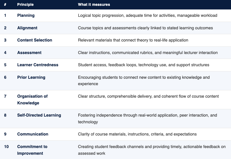
The Ten Principles of Effective Teaching
Your CER report does not only present results at the individual question level. It also aggregates scores under the UWI Ten Principles of Effective Teaching — a framework that groups related items together to give you a broader view of your teaching practice. Each principle score is the average of the survey items that map to that principle.
Using the Ten Principles framework helps you identify patterns rather than reacting to individual items in isolation. For example, if the Planning principle score is lower than expected, you can examine all three contributing items — topic progression, adequate time, and workload — together to understand where the issue lies.
A principle score above 4.0 generally indicates that students perceived that dimension of teaching positively. A score below 3.5 signals a cluster of related concerns worth exploring further.