

Overcoming Challenges to Developing Sustainable Agri-food systems in the Tropics
Presentation Guide
Time Limit | Before Starting | Outline | Power Point | Mac | Final Touch Ups | Presentation Day
Time limit
Contributing presenters will have 10 minutes to speak with 5 minutes allotted for questions. Invited speakers will be advised accordingly.
Things to think about before starting
- Oral Communication is different from written communication
Listeners have one chance to hear your talk and can't "re-read" when they get confused. In many situations, they have or will hear several talks on the same day. Being clear is particularly important if the audience can't ask questions during the talk.
- Think about your audience
Most audiences should be addressed in layers: some are experts in your sub-area, some are experts in the general area, and others know little or nothing. Who is most important to you? Can you still leave others with something? For example, pitch the body to experts, but make the forecast and summary accessible to all.
Prepare a Generic Conference Talk Outline
Most good speakers average two minutes per slide (not counting title and outline slides), and thus use about a dozen slides for a twenty minute presentation.
- Title/author/affiliation (1 slide)
- Forecast (1 slide)
Give gist of problem attacked and insight found (What is the one idea you want people to leave with? This is the "abstract" of an oral presentation.) - Outline (1 slide)
Give talk structure. Some speakers prefer to put this at the bottom of their title slide. (Audiences like predictability.) - Background
- Motivation and Problem Statement (1-2 slides)
(Why should anyone care? Most researchers overestimate how much the audience knows about the problem they are attacking.) - Related Work (0-1 slides)
Cover superficially or omit; refer people to your paper. - Methods (1 slide)
Cover quickly in short talks; refer people to your paper. - Results (4-6 slides)
Present key results and key insights. This is main body of the talk. Its internal structure varies greatly as a function of the researcher's contribution. (Do not superficially cover all results; cover key result well. Do not just present numbers; interpret them to give insights. Do not put up large tables of numbers.) - Summary (1 slide)
- Future Work (0-1 slides)
Optionally give problems this research opens up. - Backup Slides (0-3 slides)
Optionally have a few slides ready (not counted in your talk total) to answer expected questions. (Likely question areas: ideas glossed over, shortcomings of methods or results, and future work.)
PowerPoint as a tool
PowerPoint is designed specifically for use during live presentations. Therefore, the design considerations are fundamentally different to those for print or web. Colours, font size, and layout should be quite different for a live presentation. (The following tips have been extracted from the AIDS 2008 conference in Mexico City)
- Slide layout
The layout of the slides should be simple and uncluttered. If you wish, there can be a single title line, and/or a small graphic of some sort. Otherwise, the slide area should be available for your text. Do not extend your text area to the very edges of the slide.
|
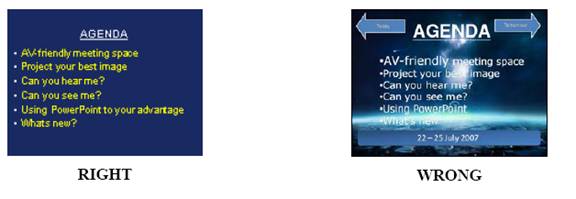
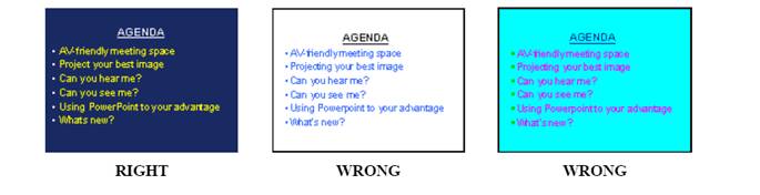
- Colours
The wrong choice of text and background colours can make your presentation virtually unreadable. White background with black text is probably the most common mistake presenters make. A white background will generate a very strong light on the screen and in that light, even a bold black text, will almost disappear.
Generally, a dark background with light text is recommended. Avoid other combinations and always avoid white backgrounds. The proven successful combination is a dark blue background with yellow text.
- Text selection and size
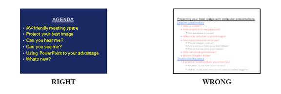
PowerPoint is designed to help you organize your thoughts into a presentation – one thought per slide. If you look at it this way, it will help you to break your presentation down into concise elements that will fit into six lines on one slide.
The proven guideline is to have no more than six lines of text and the headline on each slide. This should allow you to use a font size of 32 pt - 36 pt.
|
Text should be in a single font style and size – generally a sans serif font, such as Arial, is good. All text should be the same colour. You should only use fonts that are available in Windows, otherwise they may not be supported by the computers at the conference. The TA 2008 computers will be running MS PowerPoint 2003 which is compatible with older versions of MS PowerPoint.
- Bullet points
Each bullet should start with a bullet point and have eight words or less. Avoid using periods, ALL CAPS, paragraphs. It is better to just use brief and concise phrases instead of complete sentences. - Animations
Animations specify how the bullets on each slide appear (such as fade in one by one). But they are very difficult to work with during live presentation are often distracting for the viewers.
As a general rule, you should not use animations to build your slides. Instead, have all the bullets or other information on your slide appear at the same time. - Transitions
Transitions specify how the display changes (such as fading to black) as the presentation moves from one slide to the next.
If you want to use transitions, keep them simple!
Transitions between slides should be the same for all slides – dissolves, wipes, or box-outs are all quite effective. Avoid the more elaborate transitions – they simply distract from your message. - Pictures
Picture files can be very large and files of excessive size can affect the performance of your computer and the proper running of your presentation. We recommend the use of .JPG (JPEG Files Interchange Format) files when inserting pictures. Try to keep the pictures as small as possible (less than 100kB is recommended). Insert pictures as embedded objects, not as linked files.. - Charts and graphs
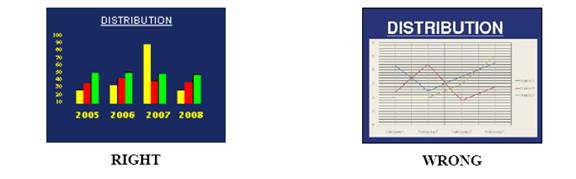
Charts and graphs are frequently a real problem with PowerPoint slides. Often charts are imported from a print source or a web page, and are far too detailed for a live presentation environment. Charts and graphs used in a PowerPoint presentation should be made specifically for that presentation and should follow the same guidelines provided above – with clarity and visibility being the primary considerations:
- Layout - should be simple and uncluttered
- Size - should fill the text area of the slide
- Lines and other chart elements - should be bold and different elements should be in different colours; all colours should contrast with the background
- Text size - should be as large as possible
|
|
If you use a MAC computer
Even if you have transferred your presentation to a Windows format, you must check your presentation in the Secretariat Centre to ensure that it is fully compatible with the conference computers.
Final touch ups to powerpoint presentations
The following website can be accessed for short tutorials geared towards giving your presentation a professional touch.
http://www.awesomebackgrounds.com/powerpointtutorials.htm
Uploading presentations
Details to be announced
Presentation day tips
- Check with the secretariat or session chair in the morning for any changes or special instructions
- Position yourself carefully with respect to the screen -- be sure not to block the audience's view.
- If you are not a native English speaker, make an effort to speak slowly and clearly enough for a large audience to understand you. Even if you are a native speaker, you will need to speak loudly and clearly.
- Keep your examples simple, emphasizing the main points, and give the audience enough time to digest each example.
- Keep to the time allotted. A conscientious session chair will ruthlessly cut you off if you attempt to exceed that limit.
- During the question & answer session at the end of your talk, be sure that your audience knows what question you are answering -- repeat a question if not everyone was able to hear it. It's often a good idea to repeat questions regardless, to make sure you have them right and to give yourself a moment to think.
- Most of all, have fun, and remember -- your talk serves as an advertisement for your work and your paper. Remember your goal is to entice the audience into wanting to read your paper